Camp Fire Context
Mapping Smoke Impacts
Sensor Calibration
Data from Purple Air (PA) sensors is often strongly correlated with official measurements of PM2.5 from a federal regulatory monitor (FRM). Unfortunately, PA data has a strong positive bias when compared with co-located FRM data. A scaling factor must be applied to convert raw PA measurements into PM2.5 equivalents and hence AQI values and colors.
This page explores functionality for:
- determining where PA sensors are co-located with FRMs
- finding and removing outliers
- statistically and visually assessing PA sensor state-of-health
- calibrating sensor data with multi-variate linear fits to co-located FRMs
- visually comparing PA sensor and FRM data
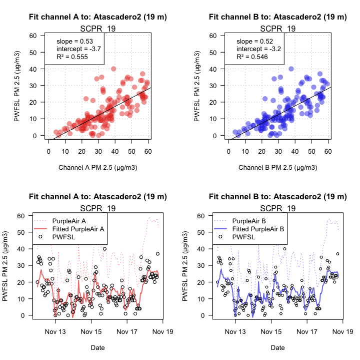
There is still a great deal to learn about the sources of variability in PA sensor data. Tools that make statistical analysis of sensor data quick and easy to assess will help state and federal agencies understand how best to use this data.
Unless otherwise stated, all timeseries analyses use data from a period of high smoke impacts from the Camp Fire: Nov 11-18.
Interactive Maps
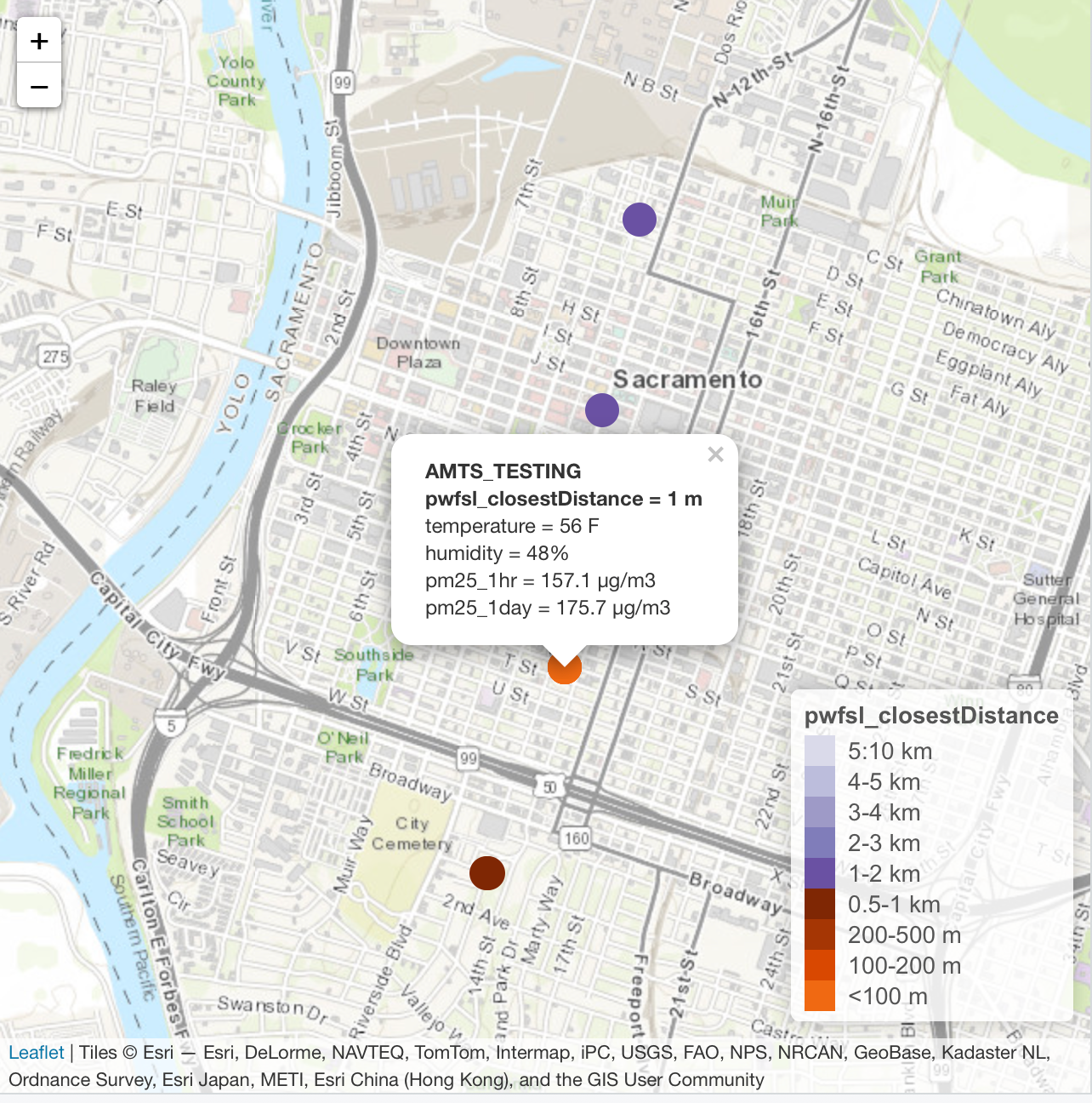
PA sensor metadata is available as a JSON file on the PA website. This data can be enhanced with important data from other sources. We find it useful to add several columns of metadata relating to FRM data made available through the PWFSLSmoke R package. Below, an interactive map of PA sensors is colored by proximity to a "PWFSL" monitor.
Outlier Detection and Removal
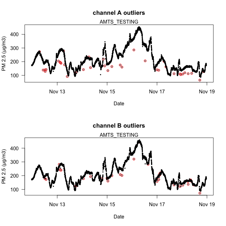
Software resets and electrical glitches regularly cause spikes in PA data. Other fields have developed robust mathematical techniques for handling such outliers. Here were are using a "Hampel" filter from a seismology package to highlight outliers. A count of the number of outliers detected could be used as a "state-of-health" metric for sensor performance.
Data Consistency
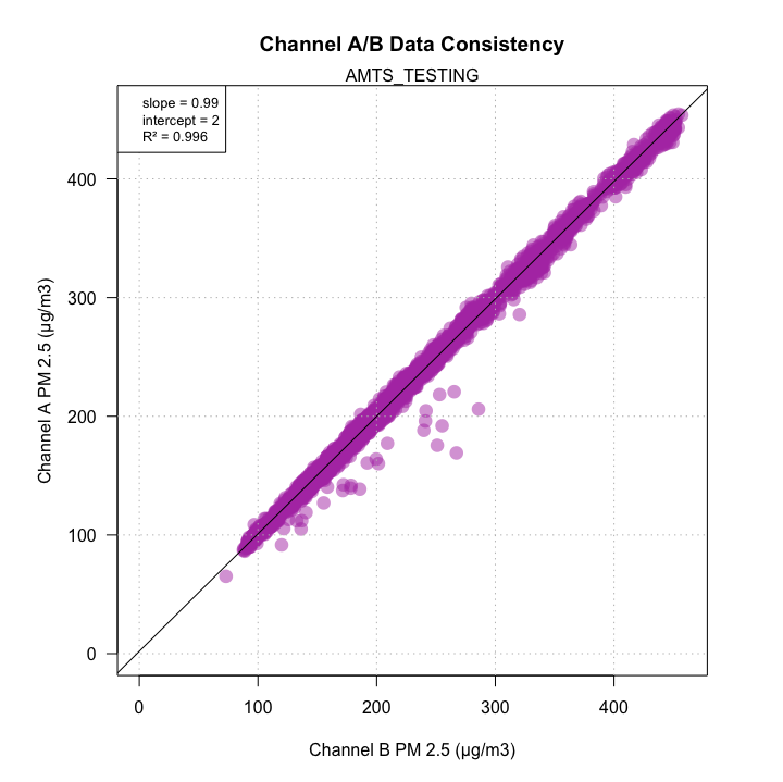
Another opportunity for calculating "state-of-health" metrics is to look at
the consistency of data reported by the two identical sensors in each PA device.
The two channels sample at staggered times so minor deviations from the diagonal
are to be expected. But any large deviation from R^2 = 1, slope = 1,
intercept = 0 would imply that the sensor is unhealthy.
Visual Inspection
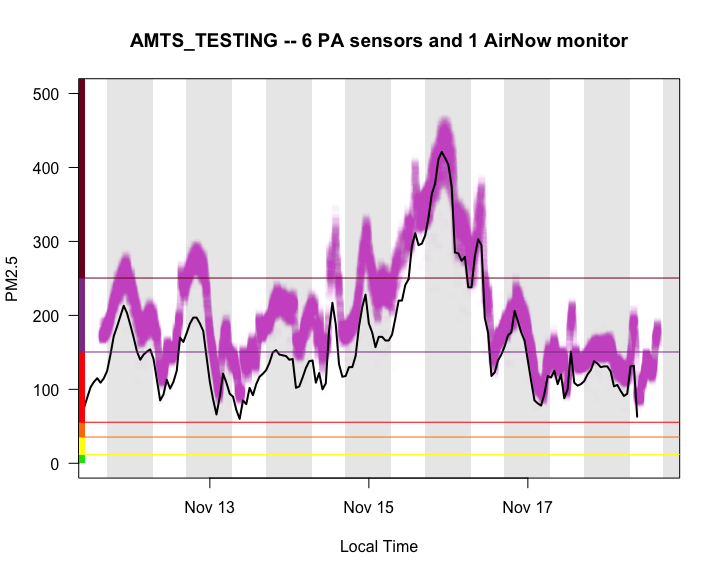
It is wise to visually inspect data before attempting any sort of statistical analysis. The following plot displays raw data from six PA sensors associated with the AMTS_TESTING site (in purple) along with data from the FRM (black line) located 1 meter away. Background shading identifies periods of day and night.
Multi-variate Linear Fit
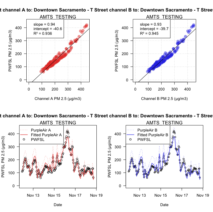
With seemingly well behaved data, we can proceed and perform a multi-variate linear
fit to calculate the scale and offset needed to map PA data onto FRM data.
Ideally, we would hope for a result with bias only: R^2 = 1, slope = X,
intercept = 0. In practice, any result with R^2 > 0.9 seems
reasonably good for PA sensors.
Sources of Variation -- Time
The plot above implies that PA sensors demonstrate a high R2 when fit to FRM data during one of the smokiest periods in California history. Wood smoke dominates the particulate makeup and the air is very dry -- ideal conditions for an inexpensive particle counter.
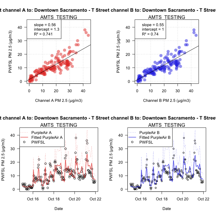
But how well do they perform in a low-smoke period. We can perform the same
analysis with the same monitor for a period in mid October. In the plots below
we see that, in period of relatively good air quality, the fit is nowhere
near as good -- R^2 = 0.74.
This implies the need for continuous recalibration.
Sources of Variation -- Space
If we keep the original time frame and move to a location outside of the Camp Fire impacts, we can test whether fitting depends on location. The plots below, from a location near San Luis Obispo, demonstrate that there are times and places where PA sensor data simply cannot be meaningfully converted in AQI values.
This implies the need for location-specific calibration.
