Leisure World Air Quality
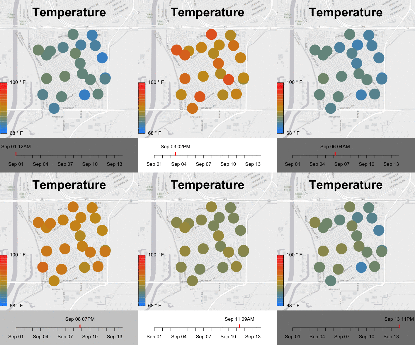
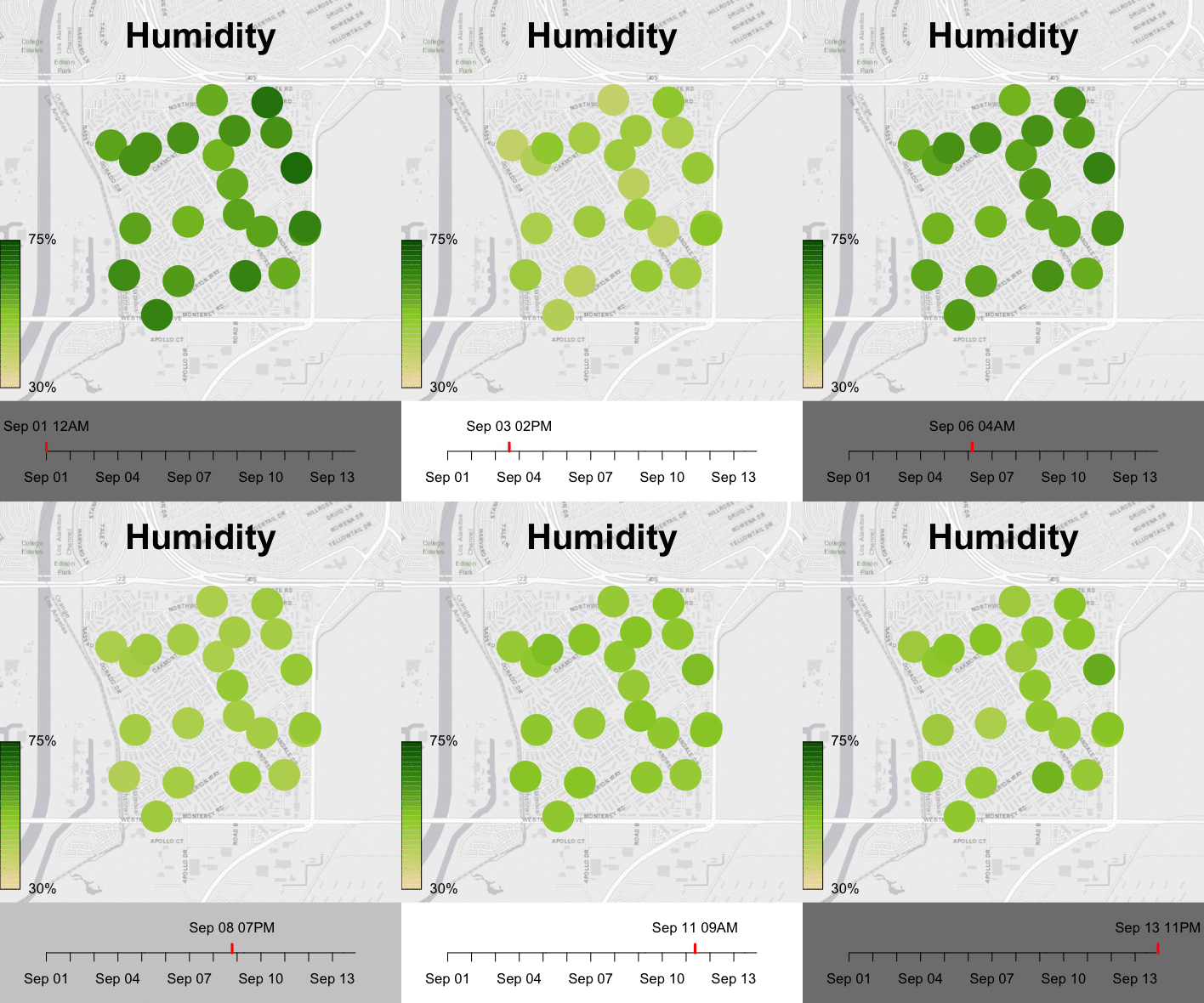
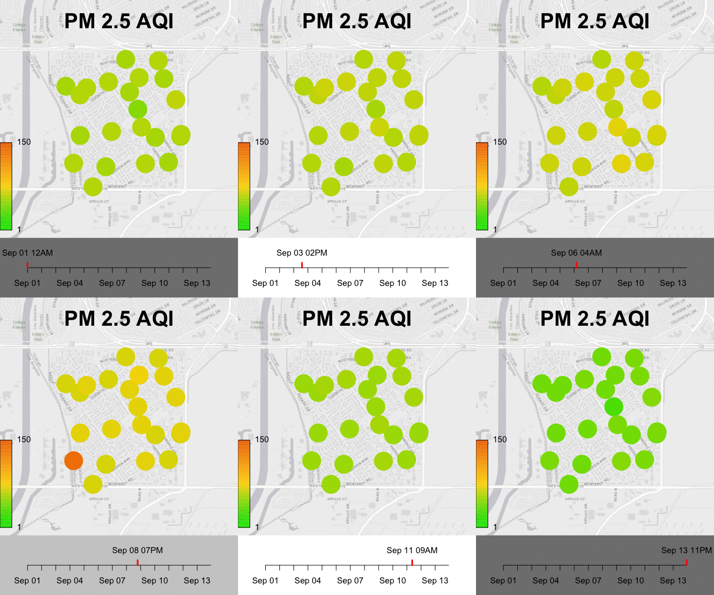
The following mini movies where generated by Mazama Science with data from a network of Purple Air sensors within the Leisure World retirement community in Seal Beach, CA.
For additional information on our work with sensor data please see our presentations at ASIC 2018.
(Thanks to Nick Massetti for encouraging us to explore movie making with this data.)
PM2.5 is associated with health concerns, especially for older communities. It is typically displayed on an AQI scale with discrete bands. For the PM2.5 visualization below we create a continuous color palette so that the diurnal "breathing" is more evident. (Please also note that values coming from Purple Air sensors tend to be high when compared with Federal Regulatory Monitors.)
We have attempted to portray the data in a way that is meaningful to locals without requiring that they learn how to interpret scientific charts. PM2.5 measurements from Purple Air sensors are displayed as colored circles while wind data obtained from Weather Underground is used to create wind barbs showing the speed and direction of the wind.
To help emphasize the diurnal cycle without obscuring the monitoring data, we darken the background of the time axis during nighttime hours.
Earlier attempts at movie making with animated gifs can be seen below.
The daily diurnal cycle apparent in temperature, humidity and airborne particulates hopefully resonates with community members' personal experiences and helps them interpret the data displayed in these movies.


